Styling a Weather Map
Aside from choosing which mapping library to use for your weather map, you can also customize the styling of many of the data sources displayed on a map. Currently, markers, polygons, and polylines associated with a weather-related data source can contain custom styling.
Overriding Default Styles
A weather map instance is already configured with default styles for all point and shape data sources based on the standard categories and colors used within Xweather Raster Maps. However, you can override these groups and styles by setting your custom style provider object for a particular layer code on your weather map instance.
The easiest way to override the default styles is to include them in your map's configuration options at instantiation within a styles property, which should be an object containing style options keyed by layer code:
aeris.views().then((views) => {
    const map = new views.InteractiveMap('#map', {
        center: {
            lat: 38,
            lon: -120
        },
        zoom: 5,
        layers: 'earthquakes,drought-monitor',
        styles: {
            earthquakes: {
                marker: {
                    svg: {
                        shape: {
                            fill: {
                                color: '#ff0000'
                            },
                            stroke: {
                                color: '#ffffff',
                                width: 2
                            }
                        }
                    }
                }
            },
            'drought-monitor': {
                polygon: {
                    fill: {
                        color: '#c98b33'
                    },
                    stroke: {
                        color: '#ffffff',
                        width: 1
                    }
                }
            }
        }
    });
});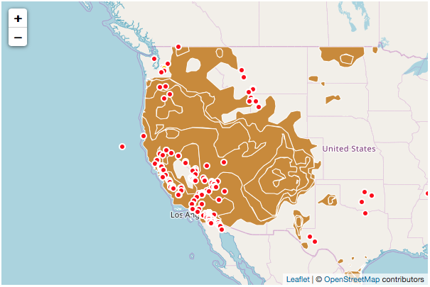
Interactive map with custom point and shape styles
Alternatively, you can set the styles when adding them to the map. Review the examples below for more information about styling various weather data sources.
Styling Raster/Tile Data
Raster layers can be styled using one of the many advanced image features available within Xweather Raster Maps, such as adding blend modes and filters (opens in a new tab).
To do so, provide an object of options as the second parameter to your weather map's addLayer method and include a styleproperty containing your style settings:
// add temperatures layer with water regions removed
map.addLayer('temperatures,water-flat:blend(dst-out)', {
    style: {
        opacity: 0.8,
        blur: 2
    }
});
Interactive map with custom raster layer styling
A raster style supports the following options:
| Option | Type | Description |
|---|---|---|
opacity | number | Opacity of the layer on the map. |
format | string | The file extension format to use for Maps image requests (opens in a new tab). Default is png. |
zIndex | number | The z-index to apply to the layer when rendering on the map. |
belowLayer | string | String identifier under which the raster layer will be inserted. This is only available for third-party mapping libraries that support it (only Mapbox GL currently). |
blur | number | Amount to blur the image. |
blendMode | number | Blend mode to apply to the image. |
Refer to the RasterStyle type documentation for additional information regarding which style options are supported and their descriptions.
Styling Point Data
Weather-related markers can be represented on a weather map using a raster or SVG image, HTML, or a dynamically-rendered SVG circle, rectangle or custom path. By default all annotations are circular SVG shapes with both a fill and stroke color.
Similar to raster and tile data, point data sources are styled by providing a style.marker object in your options when adding a layer to the weather map. Depending on your desired outcome, you then need to provide an icon, html, or svg property on your style object which will be used for rendering it on the map.
A point/marker style supports the following options:
| Option | Type | Description |
|---|---|---|
className | string | Style class name to add to the marker's DOM element when supported. |
html | string | HTML content to use when rendering the icon. |
icon | object | Provides the icon options for the style. Refer to the Icon Markers section for the list of supported options. |
svg | object | Provides the options for rendering the icon as an SVG element. Refer to the SVG Markers section for the list of supported options. |
size | number[] | Size of the icon as [width, height], e.g. [20, 15] |
callout | function | xxxxx |
skip | boolean | If true, then the marker(s) associated with the style will not be rendered to the map. |
Refer to the MarkerStyle type documentation for additional information regarding which style options are supported and their descriptions.
Icon Markers
When using icon or image marker styles, you need to provide a URL to the image file for the marker at minimum within your style's icon property. This file can either be a raster image (PNG or JPEG), or it can be an SVG file. When using raster images for markers, you'll likely want to use a higher-resolution image for retina devices. So, also include an image URL to use for retina devices (when supported by the active mapping strategy).
An icon configuration supports the following options:
| Option | Type | Description |
|---|---|---|
url | string | The URL to the icon image (absolute or relative to the script path). |
retinaUrl | string | URL to a retina-sized version of the icon image. If not provided, the url icon path will be used for retina devices. |
anchor | number[] | The point coordinates of the tip of the icon (relative to the top-left corner) as [x, y], e.g. [-5, 0]. |
The following will use a standard and retina PNG for the marker's icon:
map.addLayer('fires', {
    style: {
        marker: {
            icon: {
                url: '/img/docs/js/map/marker-fire.png',
                retinaUrl: '/img/docs/js/map/marker-fire@2x.png'
            }
        }
    }
});
Or, you can provide SVG image files for your icons:
map.addLayer('fires', {
    style: {
        marker: {
            icon: {
                url: '/img/docs/js/map/marker-fire.svg'
            },
            size: [30, 30]
        }
    }
});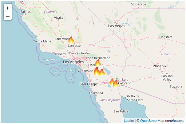
Interactive map with custom point layer styling using images
HTML Markers
If you want to render custom HTML inside your markers, you simply need to provide the html property on your style object with the HTML content string:
// marker is styled using the .marker-quake CSS selector
map.addLayer('earthquakes', {
    style: {
        marker: {
            html: '<div class="marker-quake">Quake</div>'
        }
    }
});
Then you can use CSS to further customize the styling of the content within the marker.
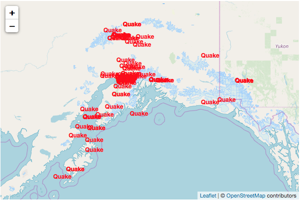
Interactive map with custom point layer styling with HTML
Note that your selected mapping strategy may or may not support custom HTML in a marker element. Refer to the documentation for your third-party mapping library to determine if HTML is supported in markers.
SVG Markers
The easiest and quickest method to customize weather markers on your map is to render them as SVG elements based on your options. You can configure your marker to render the SVG as a circle, rectangle, text, image, or custom SVG path. Then just provide the stroke, fill and/or text options.
An SVG configuration supports the following primary options where any or all options can be provided:
| Option | Type | Description |
|---|---|---|
shape | object | Provides the shape style configuration to display with the marker. See the supported shape options. |
image | object | Provides the image style configuration to display with for the marker. See the supported image options. |
text | object or object[] | Provides the text or series of text elements to display with the marker. See the supported text options. |
SVG Shape Options
The following options are available when styling shapes to be used in an SVG marker:
| Option | Type | Description |
|---|---|---|
type | string | Determines the type of shape to render. Supports circle, rect, or path. Default value is circle. |
stroke | object | Shape stroke style options. |
stroke.color | string | Stroke color. |
stroke.opacity | number | Stroke opacity. |
stroke.width | number | Stroke width in pixels. |
stroke.lineCap | string | Defines the shape to be used at the end of the stroke. Supports butt, round, or square. |
stroke.lineJoin | string | Defines the shape to be used at the corners of the stroke. Supports miter, round, bevel, miter-clip, or arcs. |
stroke.dashArray | string | Defines the stroke dash pattern. |
stroke.dashOffset | string | Defines the distance into the dash pattern to start the dash. |
fill | object | Shape fill style options. |
fill.color | string | Fill color. |
fill.opacity | number | Fill opacity. |
fill.rule | string | Defines how the inside of a shape is determined. Supports nonzero or evenodd. |
smoothing | string | Amount to simplify the shape path on each zoom level. More smoothing means better performance and a smoother appearance, where less means a more accurate representation. This option is not supported for all third-party mapping strategies. |
path | string | Defines the shape of the path for SVG elements. |
viewBox | string | Defines the position and dimension, in user space, of the SVG viewport. Only used when path is specified. |
position | string or { x: number, y: number } | Position of the shape relative to the marker container. Supports an anchor string for relative positioning, or an { x, y } point for absolute positioning. |
translate | { x: number, y: number } | Position translation amount in the x and y axes. |
transform | string | Defines a list of transform definitions that are applied to the element. |
SVG Image Options
The following options are available when styling images to be used in an SVG marker:
| Option | Type | Description |
|---|---|---|
url | string | Image URL path. |
size | number[] | Size of the image as [width, height], e.g. [20, 15] |
position | string or { x: number, y: number } | Position of the image relative to the marker container. Supports an anchor string for relative positioning, or an { x, y } point for absolute positioning. |
translate | { x: number, y: number } | Position translation amount in the x and y axes. |
transform | string | Defines a list of transform definitions that are applied to the element. |
SVG Text Options
The following options are available when styling text to be used in an SVG marker:
| Option | Type | Description |
|---|---|---|
value | number, string | Text value to display. |
anchor | start | middle | end | Determines the text container alignment relative to its position. |
size | number | Font size. |
style | number | Font style, e.g. normal or bold. |
color | string | Text color. |
padding | [x: number, y: number] | Amount of padding to insert around the text, where x is the amount of horizontal padding and y is the amount of vertical padding. |
autosize | boolean | Whether to automatically size the marker based on the width and height of the text. Default is true. |
position | string or { x: number, y: number } | Position of the image relative to the marker container. Supports an anchor string for relative positioning, or an { x, y } point for absolute positioning. |
translate | { x: number, y: number } | Position translation amount in the x and y axes. |
transform | string | Defines a list of transform definitions that are applied to the element. |
The following style configuration will render markers as a 14x14 pixel circle with a yellow fill and white two pixel stroke:
map.addLayer('stormreports', {
    style: {
        marker: {
            svg: {
                shape: {
                    type: 'circle',
                    fill: {
                        color: '#ffcc00'
                    },
                    stroke: {
                        color: '#ffffff',
                        width: 2
                    }
                }
            },
            size: [14, 14]
        }
    }
});
Note that you also must provide a size value, which is an array containing the width and height values in pixels you want your marker to be rendered at. The above configuration would render a filled red circle with a 2px white stroke.

Interactive map with custom point layer styling using SVG
If you don't want a stroke or a fill, then simply leave those values out of your object:
map.addLayer('stormreports', {
    style: {
        marker: {
            svg: {
                shape: {
                    type: 'circle',
                    fill: {
                        color: '#7101df'
                    }
                }
            },
            size: [14, 14]
        }
    }
});
Maybe you want to use a rectangle instead of a square:
map.addLayer('stormreports', {
    style: {
        marker: {
            svg: {
                shape: {
                    type: 'rect',
                    fill: {
                        color: '#7101df'
                    },
                    stroke: {
                        color: '#ffffff',
                        width: 2
                    }
                }
            },
            size: [14, 14]
        }
    }
});
Interactive map with custom point layer styling using SVG rectangles
Alternatively, you can render SVG text for your marker by using the text property, which may require yo to adjust your size property to prevent the text from being cropped:
map.addLayer('stormreports', {
    style: {
        marker: {
            svg: {
                text: {
                    value: 'Cell',
                    color: '#ff0000',
                    size: 12,
                    style: 'bold'
                }
            },
            size: [50, 14]
        }
    }
});
Interactive map with custom point layer styling using text labels
You can also combine shapes and text to create a shield element for your markers, which is useful if you want to display text values over a colored background based on the data values. By default, each SVG element will be sized to fit the text within it, including any padding as defined by svg.text.padding:
map.addLayer('stormreports', {
    style: {
        marker: {
            svg: {
                shape: {
                    type: 'rect',
                    fill: {
                        color: '#7101df'
                    },
                    stroke: {
                        color: '#ffffff',
                        width: 2
                    },
                    radius: 3
                },
                text: {
                    value: 'Cell',
                    color: '#ffffff',
                    size: 12,
                    style: 'bold',
                    padding: [4, 2]
                }
            },
            size: [50, 14]
        }
    }
});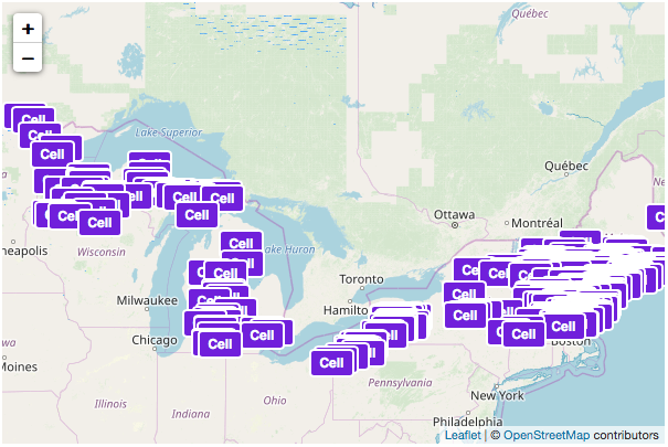
Interactive map with custom point layer styling using shapes and text labels
Custom SVG Paths
If you want even more customization options or provide more complex geometries for your markers, you can also provide a custom SVG path string to your style object. For instance, the following will render a red plus symbol for each storm report:
map.addLayer('stormreports', {
    style: {
        marker: {
            svg: {
                shape: {
                    type: 'path',
                    fill: {
                        color: '#ff0000'
                    },
                    path: 'M2 1 h1 v1 h1 v1 h-1 v1 h-1 v-1 h-1 v-1 h1 z'
                },
                viewBox: '0 0 5 5'
            },
            size: [20, 20]
        }
    }
});
Interactive map with custom point layer styling using custom SVG paths
Styling Shape Data
Styling shape data sources, such as polygons and polylines, can be done by providing the necessary stroke and fill style options when adding the layer to the map.
Similar to the other data source types, shape data sources are styled by providing style.polygon and/or style.polyline object(s) in your options when adding a layer to the weather map. Within this style object, simply provide the stroke and fill properties with your particular values. Note that only stroke options will be used for polyline styles:
map.addLayer('drought-monitor', {
    style: {
        polygon: {
            fill: {
                color: '#ff2400'
            },
            stroke: {
                color: '#ffffff',
                width: 1
            }
        }
    }
});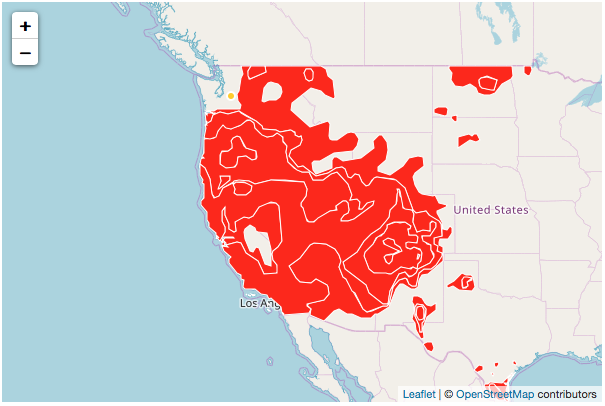
Interactive map with custom shape layer styling
Refer to the ShapeStyle type documentation for information regarding which style options are supported and their descriptions.
Data-Specific Styles
Oftentimes, point and shape data sources are rendered on the map differently based on specific values from the data they represent. For instance, earthquake markers would be rendered with different colors and sizes based on the magnitude values, or convective outlook polygons are rendered based on their category.
Up until now, we've been customizing data source styling using a static configuration, meaning all objects for that source will be rendered the same. Fortunately, the SDK also supports dynamic styling that allows you to return a style configuration based on the underlying model data that the object represents.
To use this feature, you'll need to provide a callback function block instead of a regular object for your style property which will receive the associated model data as an argument. Then, this function needs to return the style configuration to use for that object on the map. The style object can be any of the types supported by that data source type.
For example, the following is the default style configuration for storm cells, which are rendered based on their traits, such as hail, rotating or tornadic:
// dictionary that associates a color for each category
const colors = {
    default: '#000000',
    general: '#2ed300',
    hail: '#ebe100',
    rotating: '#f17200',
    tornado: '#ff2600'
};

map.addLayer('stormcells', {
    style: {
        marker: (data) => {

            // get the type property value from the passed in model data
            const { traits: { type }} = data;

            // return the style configuration for this storm cell marker
            return {
                svg: {
                    shape: {
                        type: 'circle',
                        fill: {
                            color: type ? colors[type.toLowerCase()] : colors.default
                        },
                        stroke: {
                            color: '#ffffff',
                            width: 2
                        }
                    }
                },
                size: [12, 12]
            };
        }
    }
});
Interactive map with custom point layer styling based on data values
You can see in this example each storm cell marker is filled using a color based on the cell's type code. We could take this a step further and use different sizes based on these codes as well by adding additional logic.
You can do something similar for shape data sources, such as convective outlooks:
// dictionary that associates a color for each category
const colors = {
    default: '#000000',
    general: '#b3e6b1',
    marginal: '#6cbd69',
    slight: '#f4f964',
    enhanced: '#e0b767',
    moderate: '#e0686a',
    high: '#fe59ff'
};

map.addLayer('convective-outlook', {
    style: {
        polygon: (data) => {

            // get the type property value from the passed in model data
            const { details: { risk: { type }}} = data;

            // return the style configuration for this storm cell marker
            return {
                fill: {
                    color: type ? colors[type.toLowerCase()] : colors.default,
                    opacity: 0.7
                }
            };
        }
    }
});