Color Scales
A color scale is a range of colors that represent a range of data values and is used to visualize data in a way that makes it easy to understand and interpret.
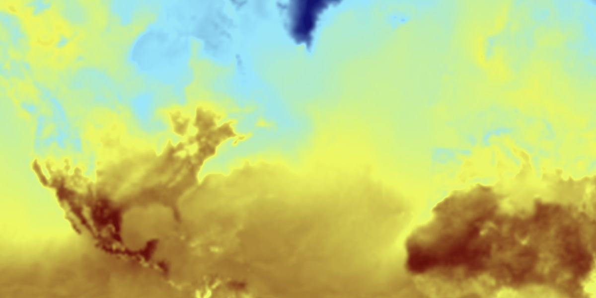
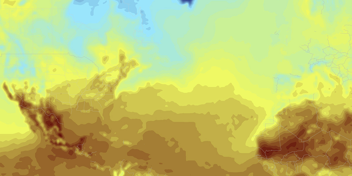
When it comes to weather data, color scales are selected in a meaningful way based on the data being visualized. For example, a color scale for temperature data might use a range of colors from blue to red to represent cold to hot temperatures. For precipitation data, a color scale might use a range of colors from light green to orange and red to represent light to heavy rainfall.
Each built-in weather layer has a carefully-crafted color scale that is designed to make it easy to see patterns and trends in the data. However, you can also create your own custom color scales to visualize data in a way that is meaningful to you and your unique use case. Alternatively, MapsGL provides some built-in normalized color scales that you can use to quickly adjust the appearance of your data layers.
Configuration
Color scales are configured using the colorscale property in the layer's configuration object. The following options are available for configuring color scales:
| Option | Description | Default |
|---|---|---|
range | Type: { min: number; max: number } ()The data range the color scale represents. | |
stops | Type: Array<number | string> ()Array of color stops to use for the color scale. Each stop in the array should be provided as a value, color pair, where value corresponds to the data value within the data's range and the color can be a CSS color string or Color instance. | |
positions | Type: Array<number> ()An optional array of positions to use for the color scale's color stops if they should not be linearly interpolated across the value range. Each position in the array should be a value between 0 and 1, where 0 is the start of the value range and 1 is the end of the value range. | |
breaks | Type: Array<number> or (min: number, max: number, interval: number) => Array<number> ()An array values to use as breaks in the color scale. This is useful for when you want to apply a stepped color scale where the color only changes at specific values rather than interpolated between color stops. The values in the array should be provided in the same units as the data's range. | |
interval | Type: number ()Desired color stop interval to generate color breaks from. When set to 0, the color scale will be a smooth gradient across the range. If you want to provide specific breaks or need to perform additional logic to determine the breaks, use the breaks option instead. | |
normalized | Type: boolean ()When true, the color scale's stops are defined in normalized values between 0 and 1 instead of the actual data range. This is useful when you want to apply a simple color scale whose stops are defined in normalized values and not tied to the data's actual range. | |
interpolate | Type: boolean ()Whether color values between stops should be interpolated based on the specified interval. If true, then colors will be linearly interpolated between stops and appear more gradient-like. Otherwise the color will be stepped and only change at the specified stop values. | |
Data-Driven Color Scales
Data-driven color scales are used to visualize data that is tied to a specific unit of measurement and value range, such as temperature, precipitation, or wind speed. These color scales are carefully designed to make it easy to see patterns and trends in the data, and to provide meaningful visualizations that help you understand the data at a glance.
Behind the scenes, the data values associated with data-driven color stops are just scaled to a normalized range of 0 to 1 as with normalized color scales outlined below but for the minimum and maximum data values used for the range.
All built-in weather layers provided by MapsGL use data-driven color scales whose color stops are associated with specific data values and value ranges for each data set. However, you can provide your own custom data-driven color scale for these layers by using the colorscale property in the layer's configuration object.
The colorscale property should be an array of color stops, where each color stop is an array with two elements: the data value and the color associated with that value. For instance, the following example shows a custom color scale for temperature data in degrees Celsius in the range (-60, 60) with color stops at every 20 degrees Celsius:
controller.addWeatherLayer('temperatures', {
    paint: {
        sample: {
            colorscale: {
                stops: [
                    -60, '#FFFFFF',
                    -40, '#58005b',
                    -20, '#121475',
                    0, '#81e8ff',
                    20, '#ecf93d',
                    40, '#6b0001',
                    60, '#7b7b7b'
                ]
            }
        }
    }
}
By default, the color scale will be linearly interpolated between color stops. However, you can customize this behavior by defining the desired data interval you want color stops to be calculated for as needed between your configured stops. This can be done by providing an additional interval property in the colorscale object with the desired interval value.
For example, using the custom temperature color scale above and changing the scale's interval to 5 degrees Celsius will produce more defined differences between values:
controller.addWeatherLayer('temperatures', {
    paint: {
        sample: {
            colorscale: {
                stops: [
                    -60, '#FFFFFF',
                    -40, '#58005b',
                    -20, '#121475',
                    0, '#81e8ff',
                    20, '#ecf93d',
                    40, '#6b0001',
                    60, '#7b7b7b'
                ],
                interval: 5
            }
        }
    }
}
Normalized Color Scales
Normalized color scales provide colors for visualizing data that is normalized to a range of 0 to 1. These color scales are useful for visualizing data that is not tied to a specific unit of measurement, such as a percentage or a ratio, or if you want to just apply a simple color scale to your data regardless of the actual value range. The MapsGL SDK provides a set of normalized color scales that you can use to quickly adjust the appearance of your data layers.
To return a list of all normalized color scales available in the MapsGL SDK, you can use the getColorScaleNames function from the styles module:
const colorScaleNames = aerisweather.mapsgl.styles.getColorScaleNames(); // ['Viridis', 'Inferno', 'Plasma', 'Magma', ...]To get the color scale configuration, you can use the getColorScale function from the styles module and use it in your layer's colorscale property:
const colorscale = aerisweather.mapsgl.styles.getColorScale('Inferno');
layer.setPaintProperty('sample.colorscale', colorscale);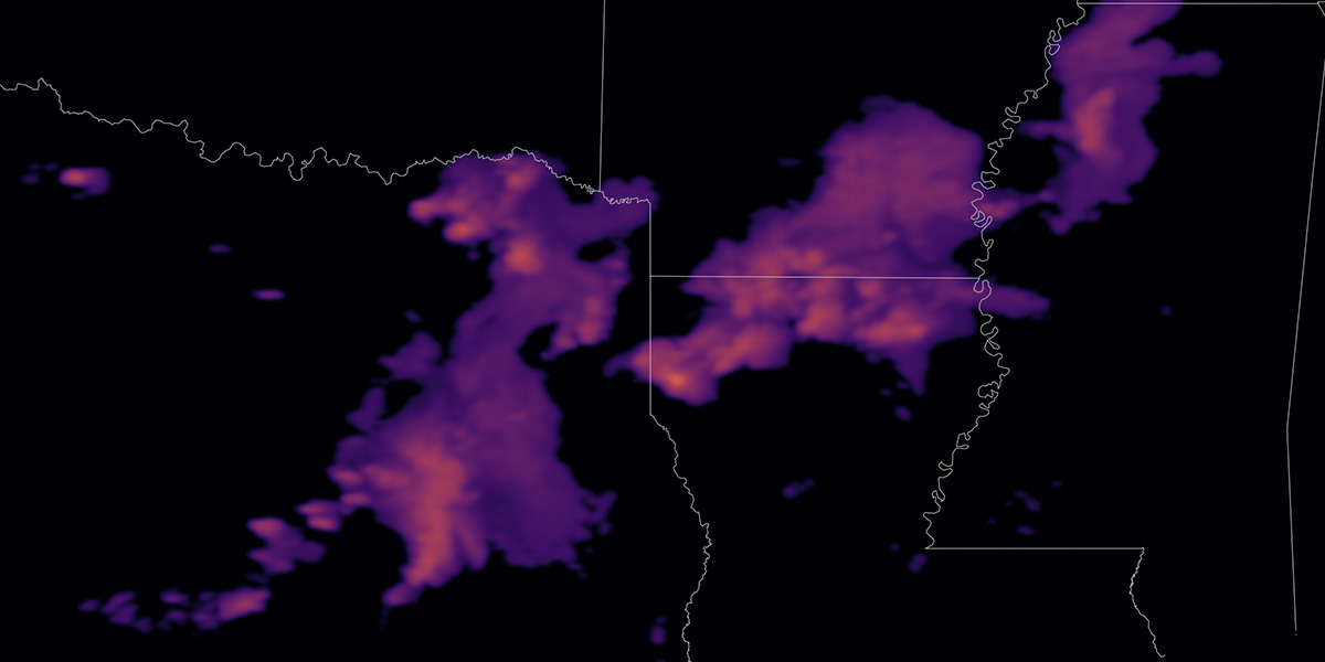
Sometimes you may want these normalized color scales to start with a transparent color or different set of colors, such as radar or satellite data that doesn't fill the entire map. In this case, you would provide an array of colors to prepend to the normalized color scale as a second argument to getColorScale:
const colorscale = aerisweather.mapsgl.styles.getColorScale('Inferno', ['rgba(0,0,0,0)']);
layer.setPaintProperty('sample.colorscale', colorscale);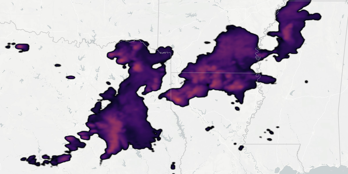
Available Color Scales
The following normalized color scales can be returned by the getColorScale function by passing the name of the color scale as the first argument: